
Table of Contents
Before optimizing the checkout (payment page), remember that it is highly recommended to follow a CRO process that allows you:
- Identify the points of friction,
- Proponer hipótesis para las pruebas y
- Establish priorities.
There is no point in starting to optimize your payment page without having some data about its use.
Once you have done your homework (session analysis, heatmaps, Google analytics events, form analysis, surveys) you will have identified points of improvement that you can prioritize for the following tests.
The following ideas can help optimize the conversion of your online store. This is not a checklist to be implemented, but ideas to be tested if you identify problems.
Security
The moment to take out the card to finish the purchase is probably when your clients may have more doubts.
Security is an aspect that you will have to take into account.
Do you use a secure connection? Having your website with HTTPS is no longer optional. Both to help convince your customers of your seriousness and to comply with basic data protection elements.
“The Hypertext Transfer Protocol Secure (HTTPS) is an application protocol based on the HTTP protocol for the secure transfer of hypertext data, i.e. the secure version of HTTP. –
https://es.wikipedia.org/wiki/Protocolo_seguro_de_transferencia_de_hipertexto
Elements of trust
Trust is central to your customers’ experience with your site; it extends to your brand image. That’s why it’s not an easily solved aspect and requires a lot of work from your web texts to the post-sale experience.
Focusing on the checkout, we can add certain elements that can help establish or consolidate trust.
Do you use company logos to help convey that sense of security?
There are several services that offer some guarantee of security to buyers. We can consider products such as McAfee Secure, Paypal Verified, Norton Secured, Google Trusted store.
Payment method brand logos also help to convey security.
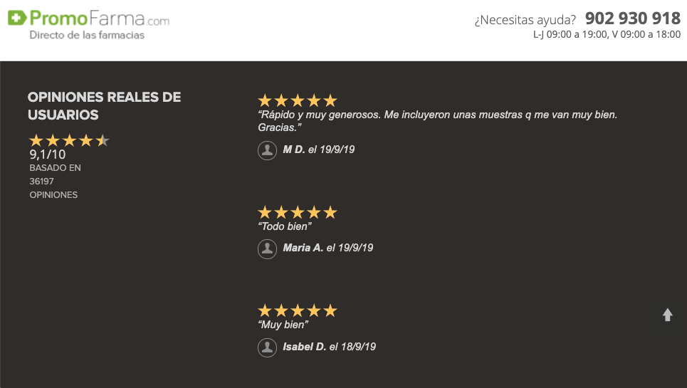
Use testimonials and ratings
Social proof is not just a concept of cognitive bias. It works as Muzafer Sherif also demonstrated in his experiments, in 1935. People tend to rely more on the reality defined by a group of people than on their personal belief.
An efficient method of implementing social testing is through testimonials. They are excellent for reinforcing statements about your product/service and alleviating concerns.
Example of Promofarma.com. They add ratings and testimonials at the bottom of their checkout page.
Very visible CTA (action button)
This may sound obvious, but it is still surprising how many e-commerce sites make mistakes. A Call to Action (CTA) should be visible on your payment page so that users know what to do next to complete their order.

So, first of all, make sure your CTA button is a button. It should then have a contrasting color and be placed in a visible space.
Think mobile
You may have read it a few times already; mobile traffic has come to dominate.

While it’s cool to work with a 45-inch screen, it’s not very smart to design primarily for your customers who use computers. Take time to think about your customers’ mobile experience.
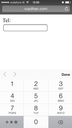
There are many factors to consider when optimizing the payment process for mobile devices.
It is not only about the size of the screen or how the form fields are displayed on the screen. Small details can have considerable impacts.
For example, when a visitor enters his phone number, do you see a keypad?
Consider offering optimized payment methods for mobiles. ¿Google Pay? ¿Apple Pay? ¿Samsung Pay? Test

Offer various payment methods
Spending so much time behind a screen looking at data may lead us to lose touch with reality: That data is real people, with their differences, their preferences and their infinite variety.
Try to offer various payment methods. We have already discussed methods such as ApplePay or GooglePay to facilitate mobile transactions. While they are solutions that will meet the needs of some of your customers, they are not the only solution.
Have you considered trying cash on delivery? There are still many people who prefer not to use their credit card on the Internet. You can help them eliminate that fear by offering cash on delivery.
Do you sell abroad?
If your national visitors have doubts, imagine someone who doesn’t live in your country. It is likely that the visitors you have from abroad are used to other payment methods.
| Payment method | Country |
| Cartes Bancaires | France |
| iDEAL | Holland |
| Giropay | Germany |
| Postpay | Italy |
| ING Home’Pay | Belgium |
| Paysafecard | Available in 43 countries |
Not forgetting the gift cards.
Making shopping easier: registered users
Allowing users of your website to register will make the purchasing process easier for them, as well as giving you opportunities to get to know them better.

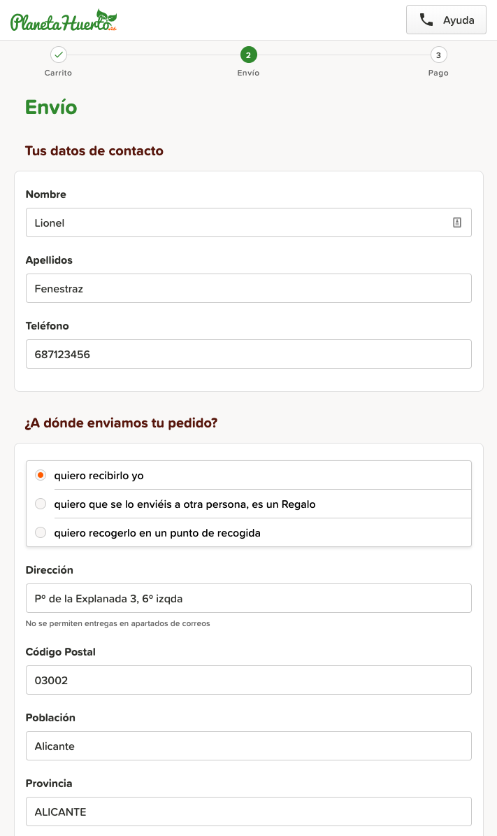
Example from PlanetaHuerto.com; it is mandatory to create an account before you can finalize your purchase. It may not be to everyone’s taste…
But if you buy again, having an account created, things are much easier since you don’t have to fill in the fields again.
Allow Guest checkout
While you may prefer that all your shoppers have an account in your store, forcing them to register in order to purchase is probably a deterrent. After all, they didn’t come to your store to register, but to buy a product.
Allowing the purchase as a guest, allows to reduce that friction created by the registration obligation. In addition, by asking for registration data (user, password) you make your form even longer.

Example of Adidas, which does not require you to register to complete your purchase. Note the registration options with Facebook or Runtastic….
Why not offer registration after purchase? As we have said before, it is a good idea to have your users registered; you can simply postpone registration at a later time.
Why not incentivize registration?
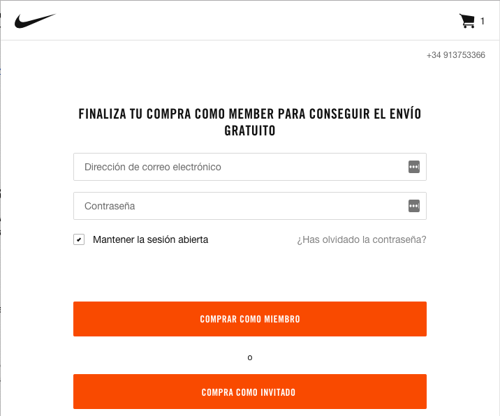
If you still think you need to have 100% of your buyers registered, you can always try to encourage registration with some offer or added value.
Nike example; to get free shipping you have to register. But you always have the freedom not to register 😉
Reduce number of fields
You may find situations where a large number of fields in your form can improve the conversion.
ConversionXL published a very interesting article on this subject: https://conversionxl.com/blog/reduce-form-fields/
However, in an ecommerce context, it is a good idea to try forms that have the minimum amount of fields. No one likes having to fill in fields on a form.

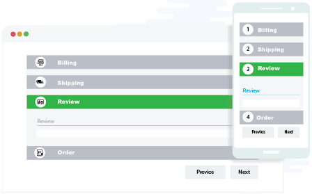
Another test you can do to reduce the stress created by the presence of many fields, is to cut the payment process in several stages. There is no absolute truth to having 1 stage or several stages; do A/B tests to determine what works best for you.
Reduce or eliminate shipping costs
One of the duties you have to do before starting with A/B testing is to ask your visitors and buyers for their experience. The surveys will give you valuable information; if you don’t offer free transport it is likely that one of the main complaints will be the cost of shipping.
If you can offset the transportation costs, try offering free shipping to all your visitors. Don’t forget to report that advantage very clearly.
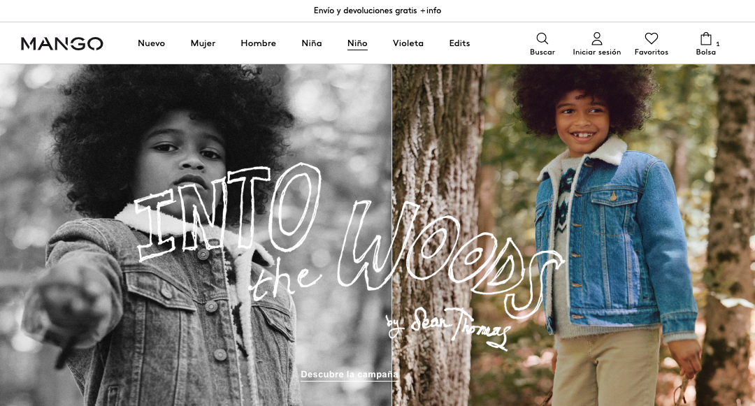
Example of Mango.com. They offer free shipping and return, reporting this on each of their pages
An alternative option is to activate free transport from a specific total cost; if you do it well, this alternative may even allow you to increase the average value of your orders.
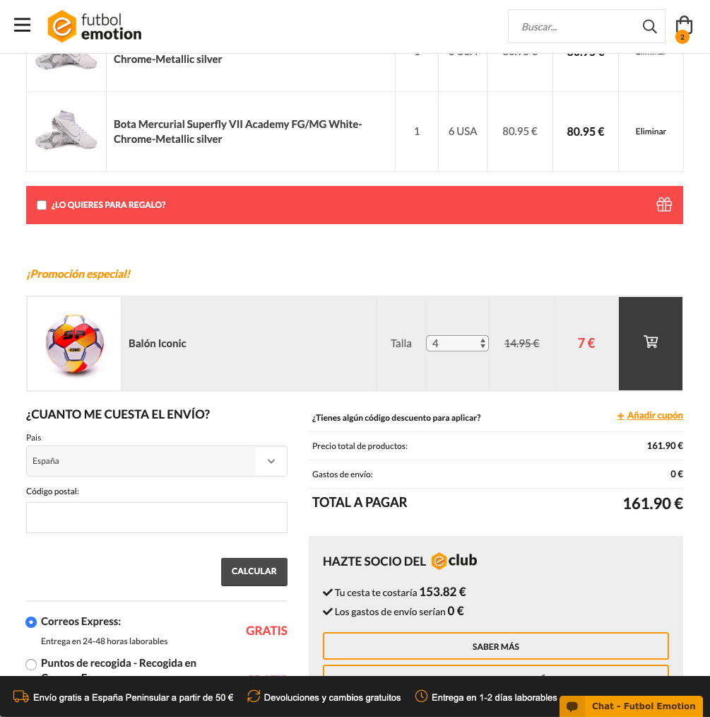
Example of Futbolemotion.com that offers free shipping starting at 50 euros.
Offer comfort with easy and free return
What if I don’t like it? What if it’s not my size? These questions are very common, and your job is to give a convincing answer.
It is true that offering free returns can result in increased returns, raising your costs and creating a lot of work for your after-sales team. It’s not an easy thing to implement but it may be worth a try.
Example of Zappos.com. They can afford to offer their customers free transport AND return.
Limit the weight of “Coupons”
When your customers see a field with the phrase “Do you have a discount coupon? Your code here”, they may lose focus and google themselves for that discount they don’t have.
You don’t want people to leave your site; if they do, there’s no guarantee they’ll come back.
Example of aristocrazy.com. The coupon may be too visible.
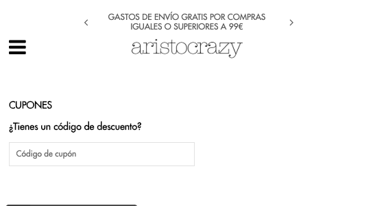
Instead of putting a highly visible field, you can try a link that will open a discount field if customers click on it.
Customers who already have a coupon code will find a way to use it. Unless you hide it really well, they’ll find it and be able to apply their coupon code.
DrMartens example. Pretty discreet, isn’t it?

Offer various delivery options
Your client has reached that end point, just before paying. More than ever, you don’t want to create tensions and lose that sale. It will help to have several delivery options, from home delivery to store or service center pickup.
Example of Decantalo.com. You can choose from 3 options to receive your order.

Think locally, internationally
Respect and understand cultural differences.
Don’t expect things to be the same all the time, everywhere. Success depends entirely on your ability to listen, to adapt, to learn and your willingness to constantly discover.
Do your homework!
Before opening a new market or launching a new product, your colleagues have done their homework: marketing, sales and even legal departments have gone through the painful tasks of market research.
If you are in charge of conversion optimization, UX or web design, it is your responsibility to collect as much information as possible about a new market. From the use of colors from a cultural point of view to visual symbolisms; it is fundamental to know the positive and negative meanings.
More about colours and their meaning here:
The country is not language
If you plan to increase your results internationally, there is one thing you should not mess with: flags are for countries, not languages. Why use a flag as a symbol of a language?
You can easily offend some potential buyers by using a flag to represent a language. The easiest solution is to call each language by its name, in the language in question. Therefore, for your French homepage it would have the text “Français”.

One of the most elegant and respectful solutions would be similar to the one used by Nike.com, where users can first select the country (use of flag + country name) and, if necessary, select their language.
Thinking locally, internationally means adapting your services to your audience.
Some items to consider:
- Language
- Currency
- Taxes
- Delivery time and costs
- Payment methods
Understandable Error Messages
Are you ready for the mistakes your users will make?
Your users will make mistakes. It’s inevitable. That’s what error messages are for, but many companies are not following the most basic needs and are annoying their potential customers in the process.
- Your error messages should clearly define the problem. A message like “Error with the field” doesn’t help; you have to improve it by a clearer message.
- Shows the error message next to the item that contains the error. It is preferable to highlight a field with a colour (red…) so that your client knows where the error is.
- If a field seems to create confusion often, you can add a message below/side to help the user enter the correct values.
You can find more examples and good practices in https://usabilla.com/blog/error-messages/ or with the reference of form design, Luke Wroblewski.
Live chat
Many buyers have questions or concerns during payment. In fact, this is typically the page that brings the most questions and uncertainty.
Some may need help with an error in a form field, others a quick answer to a question about choosing the right product or about delivery estimates.
Having a live chat or a “click to call” option directly on the shopping cart page is one possible tactic to quickly provide them with the answers they need to complete their order.
Canyon example. They have a chat available to help their customers.

Kiss: Keep it simple stupid (no distraction)
The KISS principle (Keep It Simple, Stupid), has its origin in the United States Navy. The wikipedia defines it as follows:
The KISS principle states that most systems work better if they are kept simple than if they are made complex; therefore, simplicity should be kept as a key design objective, and any unnecessary complexity should be avoided.
https://es.wikipedia.org/wiki/Principio_KISS
In the design environment and particularly in the CRO, this principle helps us to focus on the essentials. To optimize the checkout of an online store we will try to remove everything unnecessary.
Each element of your page has to have a clear role and contribute positively to the main objective of your page.
Written by Antoine de Saint-Exupery:
Perfection is not achieved when there is nothing more to add, but when there is nothing more to take away”
Antoine de Saint-Exupery
Cart abandonment email
With this solution, we are moving away from solutions applied to the checkout itself. But it’s worth trying its effectiveness.
Cart abandonment emails are messages that are automatically sent every time a shopper comes to your store and adds an item to their cart, but does not purchase the item.
These emails can also be activated when the buyer leaves the payment flow.
To send these emails, you must have the buyer’s email address. This can be done by asking them to enter their email address before starting the payment.
Alternatively, they may already be subscribed or purchased from you in the past. You can send a cart recovery email or a series of cart recovery emails to recover the sale.
Pop-up with a discount
I hate pop-ups. Entering a website and receiving a pop-up for the newsletter, another for the cookies, etc… without having seen anything yet…

However, a pop-up that jumps when you notice that the user is about to leave the page, offering some gift or discount, may result in better results. You can also control the number of people who see that pop-up, by limiting their view to carts of a certain value or to users who have spent some time on the web.
As I said, I hate pop-ups and wouldn’t use that technique before trying another, more elegant and less aggressive solutions.
Most common questions
If you identify frequently asked questions from your customers, you can always add the answers in the form of small links, located just where that question might occur.

Example of maria-pascual.com. Choosing the right size can create doubts; a small link near the CTA (Call to action) allows clients to resolve their doubts quickly and just when that uncertainty occurs.
To summarize
Having a frictionless payment process, reducing anxiety and making things clearer and more focused on placing the order go a long way in creating an enjoyable payment experience.
Applying the CRO to optimize the checkout is no different than in other parts of your website. First you will have to collect and analyze the data, and then you can try out some of the solutions we have seen. If you don’t have time or you prefer a professional team, you can count on a CRO agency like ours.
