Table of Contents
Product page optimization is undoubtedly one of the keys to obtaining a better conversion rate in your ecommerce. Previously, we talked about ideas to optimize the checkout, where we focused on the user experience when paying; today, it’s about offering a friction-free product page that allows the user to buy in our store with complete confidence.
Optimize product page: Call to Action (CTA)
What is a call to action?
It is a ubiquitous term, but what does “call to action” really mean?
In simple terms, a call to action is a button or link that represents the most desired action for a site visitor.
This “most desired action” may vary from page to page, and different CTAs will serve different functions along the customer’s journey.
When a visitor comes to the product page, for example, you probably want them to add a product to their cart. During payment, you want to make sure that they complete the form and click on the purchase button. After the purchase, the ideal action could be for customers to click a button to share on social networks.
En cualquier caso, hacer clic en un CTA representa el mejor resultado posible para los visitantes de su sitio.
The CTA must be very noticeable, the main actor in the visual hierarchy of the page
If you want your users to complete a specific action, make sure that action is highly visible. On the product page, the main action is usually “Add to Cart”; the visual hierarchy of the page must match that goal.
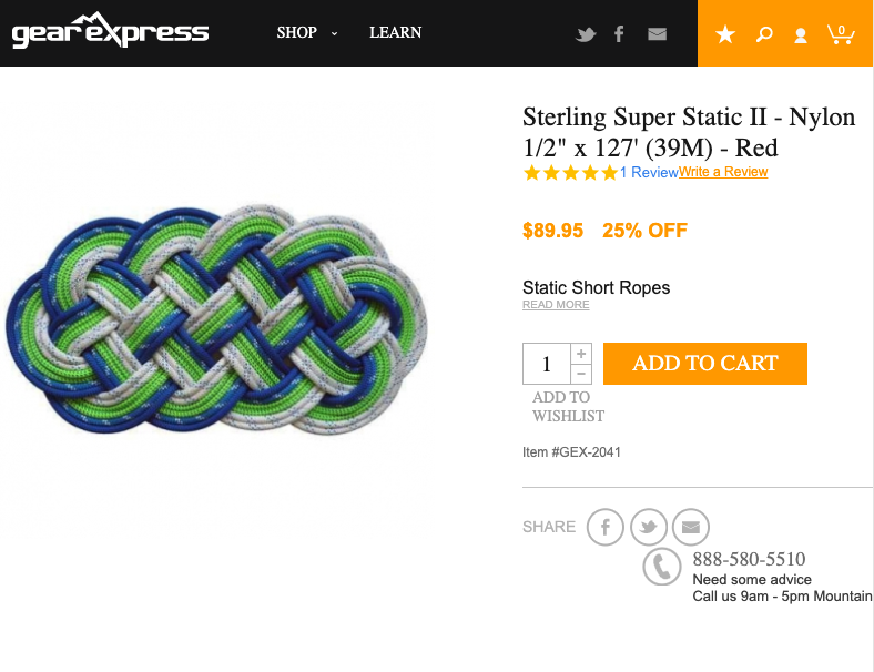
GearExpress – Single and Very Visible CTA
Plenty of “blank space” around your CTAs
A simple way to make your CTAs very visible is to leave a lot of white space around them.

Mango.com – A lot of blank space
The colour of the CTA button should contrast with the colours of the rest of the page
Why should we care about contrast?
The more attention the CTA button receives, the more likely a visitor is to click on it. The higher the contrast between the elements on the page and the CTA, the more attention is directed to the button.

Dockers – VERY clear CTA
Product page optimization: Principles of persuasive design
Minimize the visual complexity of your site design
A complex page requires more effort and consequently creates friction that can impact negatively on conversion.
As far as possible, try to apply the KISS principles (https://es.wikipedia.org/wiki/Principio_KISS); simplicity helps.
There will always be time to add secondary elements or features whose impact you can measure with A/B tests.
Maximizing prototipicity
Prototipicity is the basic mental image our brain creates to categorize everything it interacts with. From furniture to websites, our brain has a template of how things should look and feel.
On the Internet, prototipicity is divided into smaller categories. We have different but specific mental images for social networks, e-commerce sites and blogs. If one of those websites lacks something of our mental image, we will reject the site on the conscious and subconscious levels.
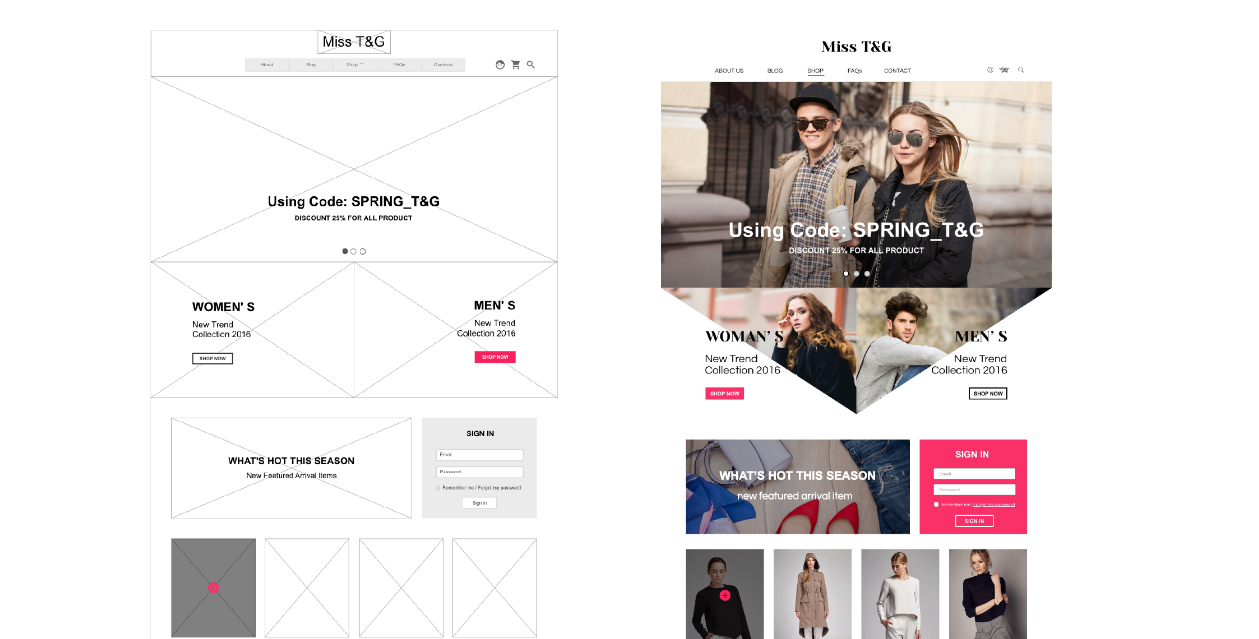
Prototipicity
Create a clear visual hierarchy that corresponds to the most important elements on the page
The visual hierarchy is the arrangement of graphic elements in a design in order of importance of each element. The visual weight defines the importance of an element in the hierarchy of a design, communicating in the eyes of the viewer what to focus on and in what order.
Visual hierarchy: Giving importance
Size matters, right? While the classic adage is still under debate, size is possibly the most effective way to emphasize the visual elements. In short, the larger elements attract more attention than the smaller ones.
This is precisely why newspaper headlines appear in larger sources, and major stories often have even larger headlines than articles on the rest of the page. In any design, the larger elements, whether words or images, will not only be more noticeable, but will also carry the strongest message.
Just as larger elements are perceived to be more important than smaller ones, bright colours often attract more attention than duller tones. For example, if a single word in a block of text is highlighted with a bright color, it immediately catches the reader’s attention.
Contrasts can also more effectively emphasize specific elements than a spectrum on a softer scale. Placing a red object on a green or black background will attract more attention than the same red object on an orange or purple background. Like colour contrast, an element’s style can help create emphasis.

Types of visual hierarchy
Avoid paragraphs that have more than four lines of text
Very long paragraphs are not ideal for online stores; it is not a question of writing like a book but of providing information to users.
Proflowers.com – Short paragraphs
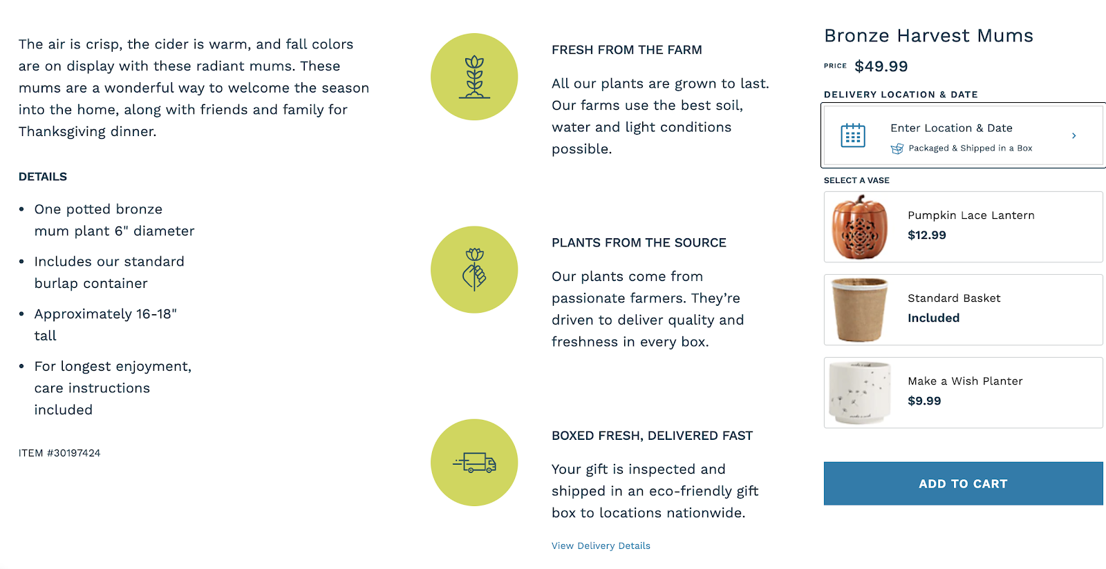
Maximize the size and quality of product images
People hardly buy anything without seeing it. Usually, they also want to touch it, hold it or spin it. They can’t really do that stuff on the Internet. Then, to compensate for all that, you must work twice as hard to bring your products to life through excellent photography and graphics.
The images should offer a very detailed view, view of use within a context and if we can, a short video.
Don’t be afraid to offer a wide variety of images.
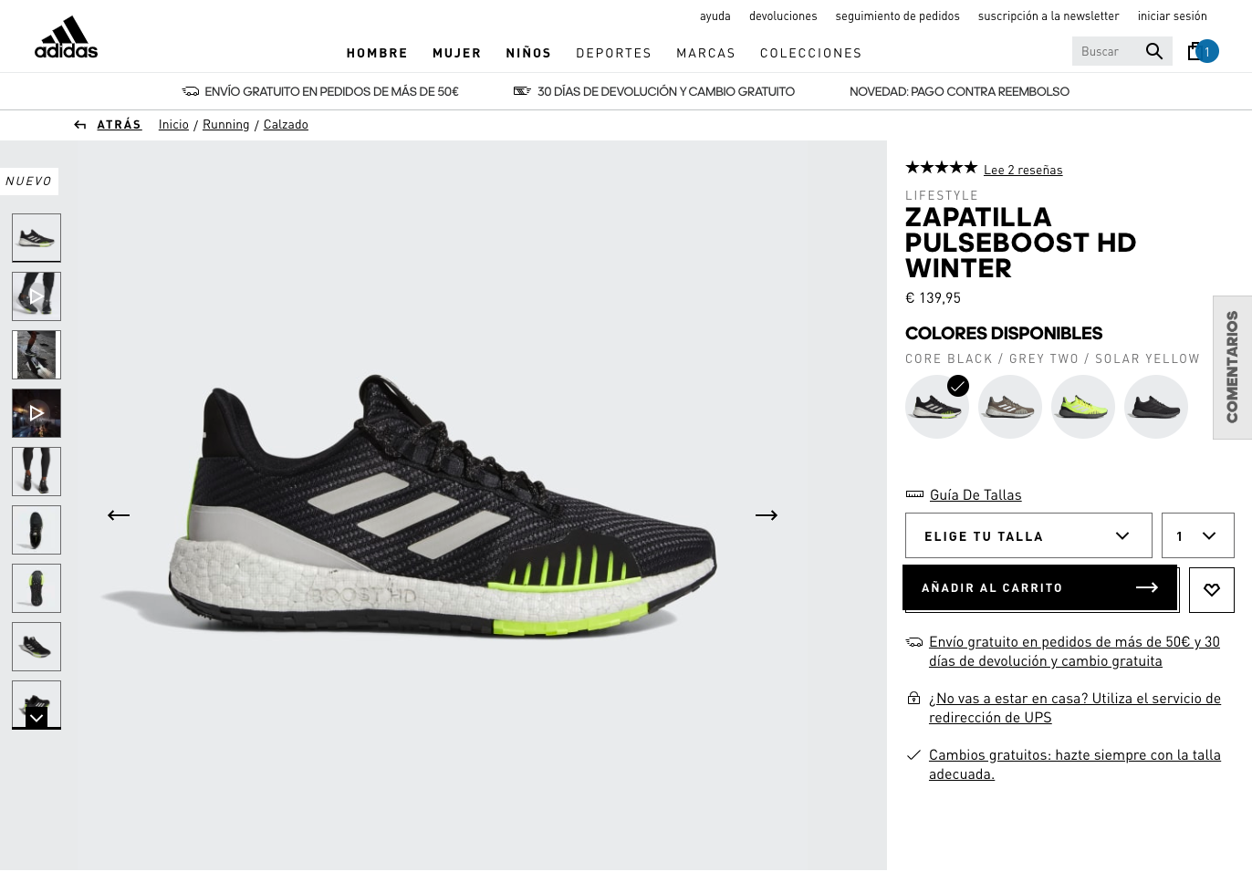
Adidas.com – Large, quality photos
Objective: One action per screen
To avoid confusing users, we will try to propose only one action per page.
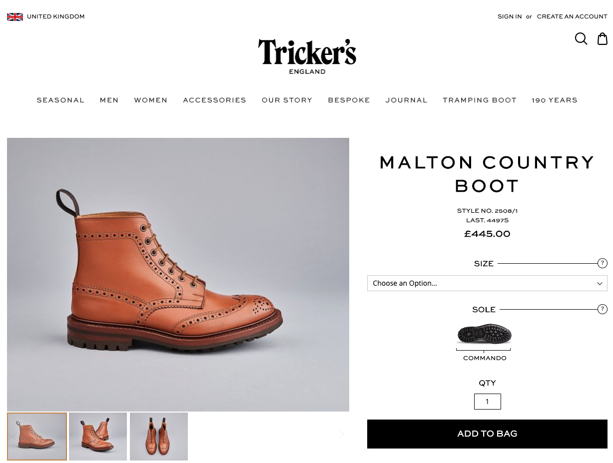
Tricker’s – One action per screen
Optimize product page: Typography and content
Avoid texts smaller than 16px in size
By default, it is recommended to use 16px texts or equivalent for page text.
We will make reading easier and avoid tiring users.


Obut.com – 12px font vs 16px. Small differences that count.
Use traditional fonts (Arial, Georgia, Tahoma, etc.) for body texts
Readability is the key. You definitely don’t want to exaggerate calligraphy sources to the point where readers can barely make out the words you’ve written.
In fact, the use of standard fonts can better appeal to readers’ minds, since most people are familiar with them.
Simplicity increases the readability of your website and increases its visual appeal. You should strive to use a minimum number of fonts on your website to maintain structure and professionalism.
The typography of your website depends largely on your needs. For example, when promoting your brand, custom fonts can be useful at that point.
In addition, consider the device on which users will primarily access your website, be it laptops, tablets or mobile phones.

Mapfre in “Comic Sans” is not the same…
Split the text
Give your text some air with lists (ordered and unordered), images, subtitles every 1-2 paragraphs, and/or paragraph breaks every 3-4 lines. This way the reading will be easier and you will not demand much effort from your clients.

Lacoste.com – Easy Reading
The optimal length of the text lines is 50-75 characters
This is a recommendation by https://cxl.com/. During numerous conversion optimization tests, they realized that short lines of text tend to get better results. As with everything with the CRO, it is advisable to do your own testing to confirm that the recommendation is also positive with your audience.
Optimising product page: Reduce doubts
We want to reduce as much as possible the doubts that may occur on the product page. A customer who has doubts is quickly moving away from the purchase; our aim is to reassure the customer by offering useful and easy to understand answers.
Ease of payment
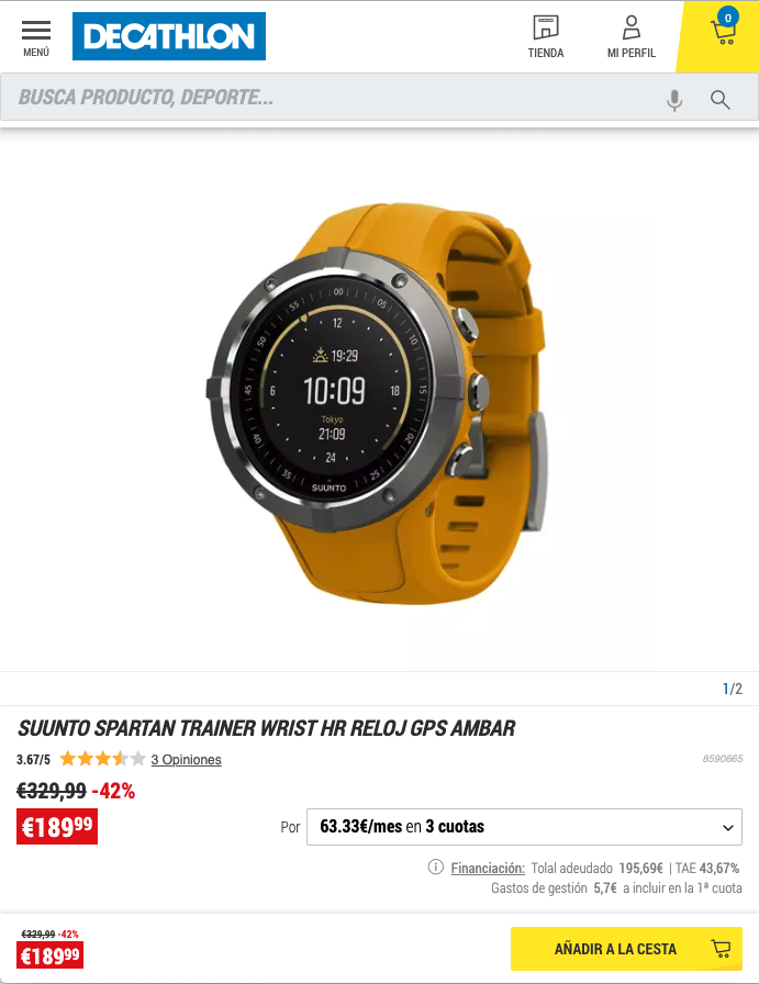
Decathlon – Installment Payments
If you can offer financing as a payment method, you can try showing that solution on the product page, near the price.
Ease of delivery and return
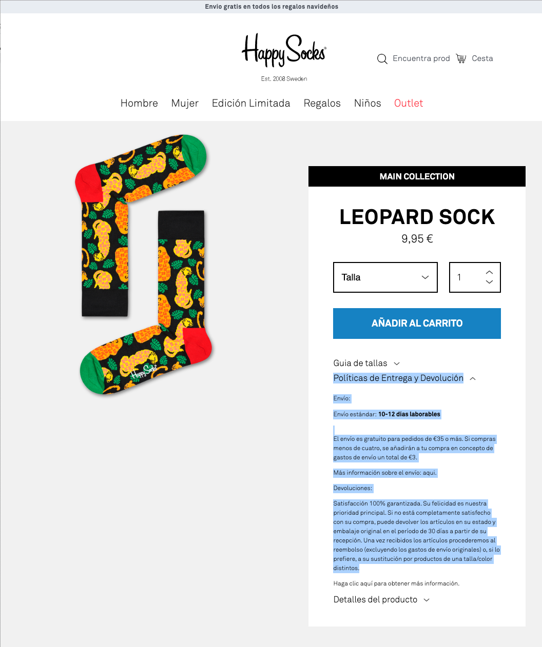
HappySocks – Delivery and Return
We cannot forget to inform about delivery times and costs; it is a basic information that users expect to find easily. If we can, it is highly recommended to offer free delivery.
Information on sizes

Zara – Classic size chart
Particularly in fashion ecommerce, sportswear or accessories, sizes are often one of the main points of friction. Would you buy without being 100% sure that the size is right?
Apart from the classic size chart that opens when you click on a “Size” link near the “Add to Cart” button, there are very complete solutions to make it easier to choose the right size. Example of TheNorthFace with FitFinder:
TheNorthFace and FitFinder
Relevant information
If you sell technical products or products whose use is very specific, it is likely that your buyers are looking for information very relevant to the use of that product.
An example with Gobik and his triathlon suits; The chamois and the range of use (temperatures) are very relevant data for those who are interested in buying/using that product.
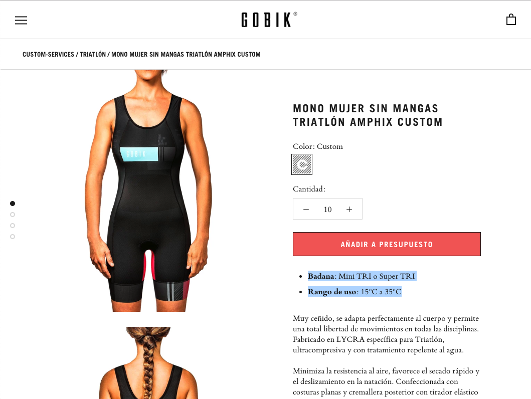
Gobik.com – Relevant information
Cognitive biases
Bandwagon Effect with Reviews
The bandwagon effect, commonly known as the “herd mentality”, is the tendency to do or believe the same as other people. It is based on the concept of social proof.
Few of us enjoy being perceived as different and find it more reassuring to do the same as everyone else. As a result, we have a tendency to accept the crowd when it comes to making decisions; even if it is wrong, our illogical brains convince us that it is not so bad, at least we are in the same boat as everyone else.
With this in mind, e-commerce owners can seek to boost the popularity of their products and services. In doing so, visitors will feel that they are following in the footsteps of hundreds of other people, and this “strength in numbers” approach will give them the confidence that they are like everyone else.
Amazon.com Reviews
How to use this bias in your e-commerce store
Use comments and reviews. If you have a lot of reviews, make them visible: the more reviews a potential buyer sees, the more confident he or she will feel. On the other hand, if you can’t collect enough comments, then you’ll want to stay away from this option. Just showing one or two reviews can have a negative effect and make potential customers believe that few people are buying your product.
FOMO syndrome with availability
FOMO (Fear Of Missing Out) is a common concern that others may have rewarding experiences from which one is absent. This social anxiety is characterized by “a desire to be continually connected. Although this is mainly a bias related to the use of social networks, many ecommerces use this bias with the availability of their products or offers.
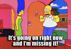
Homer suffering FOMO
For example, in the Decathlon store, when a product becomes out of stock, the user sees a message “1 unit left, don’t run out!
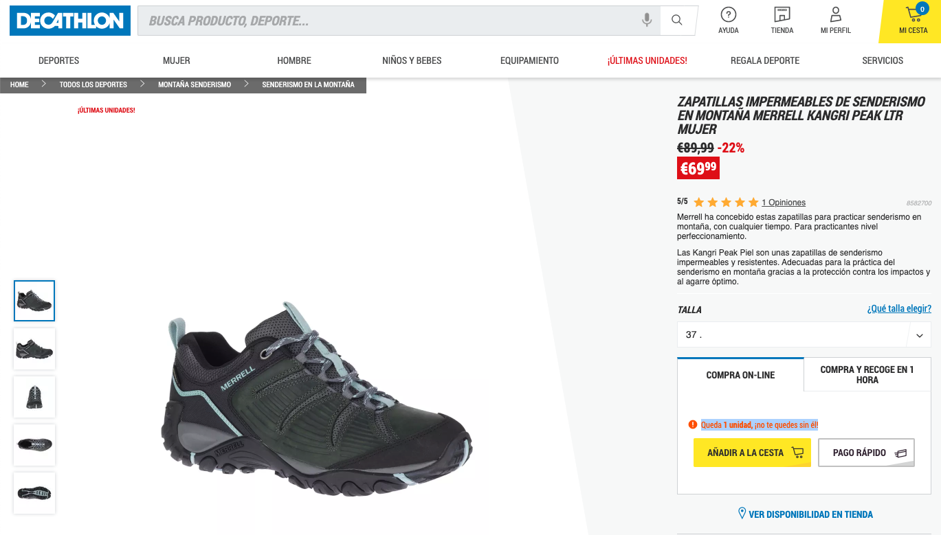
Decathlon – FOMO
Have you tried it in your online store?
To see more about cognitive biases, we recommend our article 19 cognitive biases to increase the conversion of your marketing.
Don’t hesitate to ask for help in optimizing your ecommerce!
If in spite of the explanations on this page and on our websitein general, you feel a little lost or want more information to optimize your ecommerce, do not hesitate to contact us.
Our founders are also entrepreneurs. Their passion is to help companies grow through CRO and digital marketing. So don’t hesitate, we’re here for you too.
